Our New Brand: Driven by Community and Staff
In our new brand approach, we are adopting language and visuals guided by clients, community partners, tribal governments, and staff voices.
Over the years, we heard a variety of challenges and feedback about the DSHS logo, mission, vision, and values.
As we looked more closely, we realized many of the words and visuals we used were out of step with how many people describe DSHS services and themselves.
Our New Logo:
Our New Mission:
We partner with people to access support, care, and resources.
Our New Vision:
People find human services to shape their own lives.
Our New Values:
Welcome all with access and inclusion.
Serve with respect and dignity.
Collaborate with community.
Improve services continually.
Communicate with clarity and choices.
Our new brand is also a core element of our new DSHS Strategic Plan here.
Why update the DSHS logo, mission, vision, and values?
Historically, the DSHS logo, mission, vision, and values had been decided internally with no input from the community and staff.
Using a human-centered design process, we engaged thousands of clients, partners, and staff.
More than 4,000 people participated in surveys and hundreds participated in interviews and focus groups to brainstorm ideas.
Clients and staff first told us what was working well and what needed improvement. Their guidance then directed what changes we made.
Is this an expensive update?
We are sticking to a low-budget commitment for this brand update through the following measures:
- All design work is done internally with communication staff.
- Building signage will be updated according to a regularly planned maintenance schedule.
- Existing printed materials will be distributed until a reorder is needed.
When will changes happen?
Beginning in October 2024, DSHS will begin updating our digital materials and website with the updated brand. Building signage will be updated over multiple years along our typical maintenance schedule. Printed materials will be updated over one to two years as typical reordering is needed.
A Look at the Brand Updates
Coming in October, DSHS will begin updating our materials with this new logo, mission, vision, and values. Here's a look at how the community and staff helped us improve our language and visuals below.
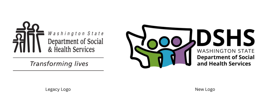
Old Logo:

Feedback on our old logo, which has been in use since the 1970s, included:
- Positives: The logo is recognizable and represents families who seek support at DSHS.
- Challenges: The logo looks dated and rigid. The logo excludes people with disabilities and individuals without children.
- Ideas for Improvement: Keep some elements of the logo consistent and add the DSHS acronym.
A community member said, "Switch the logo up just a little bit to know it's for families and individuals. All are welcome here."
A staff member said, "People are central to why we are here. So something with people that shows connection, inclusion, support, and well-being."
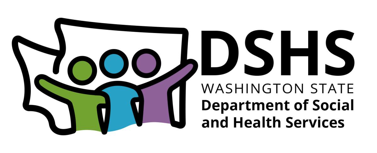
New Logo:
The new DSHS logo maintains three people at the center of the design, with bold graphic lines and arms raised, a nod to our legacy logo.
Key changes include:
- The three people now have more flexibility to represent a family, an individual and their care team, or the diverse communities we serve across Washington state.
- The Washington state outline helps distinguish DSHS as a state agency versus federal, county, and city human service organizations.
- The DSHS acronym is added above the full name for ease of identifying the agency, such as at a local office building.
- Color is added to the logo for the first time. Green represents the Evergreen state, blue represents partnership and trust, and purple represents equity and justice.
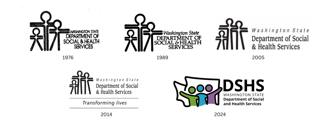
Above is a visual history of the DSHS logo over the last 40+ years. Our new design brings the biggest update to the agency's logo with the addition of color and the departure from the more rigid "stick figures" from the 1970s. To ensure some consistency, three people, with arms raised, outlined in thick black lines remain the primary focus of the logo. The Washington state outline and DSHS acronym are added via community suggestion to better identify the agency to the public.
Old Mission:
Transforming Lives.
Feedback included:
- Positives: This mission resonated strongly with staff and their passion for service. Some clients also felt it was accurate.
- Challenges: A larger, majority of clients felt this mission was inaccurate, overstated, and even patronizing.
- Ideas for Improvement: Focus on DSHS in a supporting role in people's lives and more specific to what DSHS does.
A staff member said, "I do not think it is clear what benefit a client will see in our mission."
A community member said, "I do not think DSHS transforms lives. It's people themselves, with the help of services provided, that are able to transform their own lives."
New Mission:
We partner with people to access support, care, and resources.
We achieve this mission through programs such as:
- Food, cash, and medical assistance.
- Vocational rehabilitation.
- Long-term care.
- Developmental disabilities services.
- Behavioral health treatment.
Key changes include:
- A perspective switch from "transforming" people to being a strong, reliable, and helpful partner.
- Saying more clearly what services DSHS provides.
Old Vision:
People are healthy. People are safe. People are supported. Taxpayer resources are guarded.
Feedback included:
- Positives: "People are supported" was the strongest component that felt the most accurate to people.
- Challenges: "Healthy" and "safe" were misleading or inaccurate. "Taxpayer resources are guarded" sounded judgmental.
- Ideas for Improvement: Focus on ideal outcomes defined by the community and clients themselves.
A community member said, "Healthy does not feel right to me as a disabled person. There's nothing DSHS can do to help me be 'healthy.'"
A staff member said, "We need to ask people who come to us for help what makes their life meaningful and prosperous."
New Vision:
People find human services to shape their own lives.
We aim to achieve this vision through priorities such as:
- Building economic justice.
- Making modern changes to behavioral health.
- Advancing person-centered services.
- Serving people in their home community.
- Innovating through technology.
Key changes include:
- A focus on people defining the best outcomes for their own lives vs DSHS describing it for everyone.
Old Values:
Honesty and integrity.
Pursuit of excellence.
Open communication.
Diversity and inclusion.
Commitment to service.
Feedback included:
- Positives: Values are mostly strong and make sense for DSHS staff.
- Challenges: Values are internal-facing and make less sense for clients and the community.
- Ideas for Improvement: Plain talk the values and speak directly to the community.
A community member said, "I'd love to see collaboration. So when you go to DSHS, you are a whole person. No need to move from one silo to the next."
A staff member said, "The values are clunky and cumbersome. They should be recognizable and easy to remember to reinforce our mission."
New Values:
Welcome all with access and inclusion.
Serve with respect and dignity.
Collaborate with community.
Improve services continually.
Communicate with clarity and choices.
Key changes include:
- A focus on our customer service and partnership with the public.
- Words and phrases are simplified.
We thank all of the community members, partners, and staff who shared valuable insights and ideas. Their ideas will guide our language, our goals, and our visual imagery for years to come.
Beginning in October 2024, we will begin the budget-friendly, multi-year process to update the brand across all of our materials.